

Clearly marked house numbers on mailboxes directly influence delivery efficiency and reduce postal transit errors. Understanding the visual mechanics and materials involved in physical addressing ensures your mail and packages arrive without delay.
The Optics of Visual Recognition in Postal Logistics
Postal delivery operates on rapid visual verification. When a carrier approaches a property, their cognitive processing relies on high-contrast, recognizable patterns. Human visual acuity decreases significantly in low-light conditions or during motion, meaning a house number must be identifiable within a fraction of a second. Sans-serif fonts are optimal because they lack decorative strokes that can blur together at a distance. The stroke width of each digit should be at least one-fifth of its height to prevent optical blending, ensuring that different numbers remain highly distinct from afar.
The Role of High Contrast and Photometric Properties
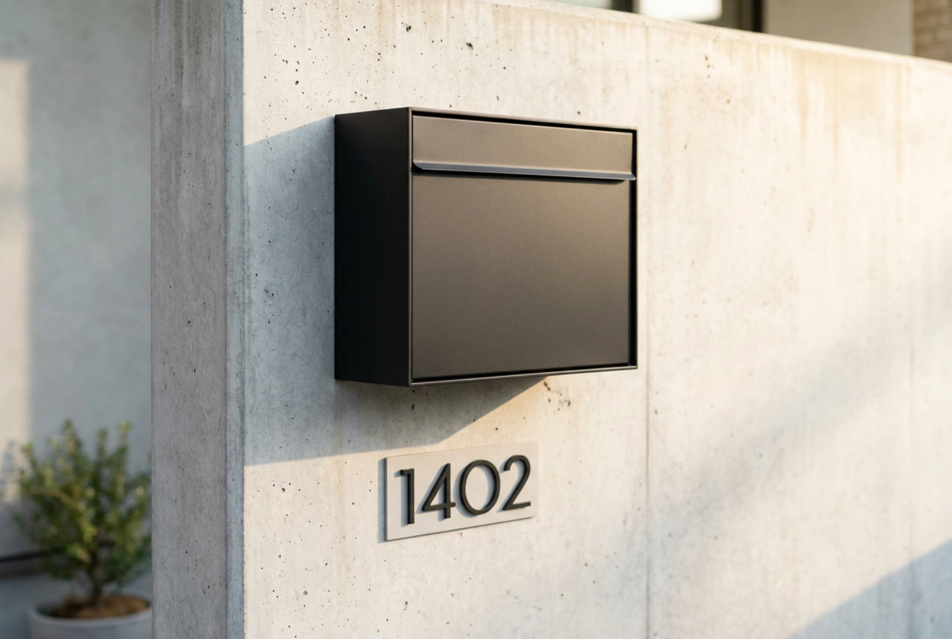
Contrast is the most critical element in legibility. Light reflectance value measures the proportion of light reflected from a surface. To achieve maximum readability, the contrast between the digits and the background of the mailbox must be at least 70%. Placing matte white numbers on a matte black or dark grey mailbox provides the highest possible contrast ratio. Using reflective materials is highly beneficial for nighttime deliveries. Retroreflective films or plates bounce light directly back to the source, significantly increasing visibility in dark or foggy conditions compared to standard glossy or metallic surfaces which cause specular reflection and glare.
Material Selection for Long-Term Legibility
Outdoor mailbox numbers are subject to intense environmental degradation, including ultraviolet radiation, temperature fluctuations, and moisture. Choosing the right material ensures the numbers do not fade, crack, or peel, which would alter their shape and reduce legibility.
- Anodised Aluminium: Highly resistant to corrosion and UV degradation, retaining its contrast over decades without oxidizing.
- Marine-Grade Acrylic: Ideal for laser-cut numbers, offering excellent UV stability and maintaining crisp edges that do not warp under direct sunlight.
- UV-Stabilised Vinyl: A cost-effective adhesive option, but it must be rated for outdoor use to prevent adhesive failure and edge curling caused by temperature cycles.
Optimal Mounting Height and Geometrical Placement
The geometric positioning of the number on the mailbox determines how easily it can be spotted from a delivery vehicle or by a carrier on foot. The ideal placement is on the front-facing surface of the mailbox at eye level, typically between 1.2 to 1.5 metres from the ground. If the mailbox is mounted perpendicular to the street, numbers should be placed on both lateral sides to ensure visibility from both approach directions. Ensure that no nearby foliage, structural pillars, or architectural overhangs cast deep shadows over the numbers, as shadows drastically reduce contrast during sunny hours.
Preventive Maintenance of Mailbox Signage
Over time, atmospheric soot, dust, and biological growth like algae or lichen can accumulate on the surface of the numbers, degrading the contrast. Regular cleaning with a mild soap solution and a soft microfibre cloth prevents buildup without scratching the reflective coatings. Avoid harsh abrasive cleaners or solvent-based chemicals, which can strip protective UV coatings or degrade the adhesive backing of vinyl decals, leading to premature failure of the visual system.