

Labeling apartment mailboxes effectively requires understanding material science and visual ergonomics to ensure delivery accuracy and long-term durability. By choosing the correct adhesives and substrate materials, you can prevent peeling, fading, and degradation caused by temperature shifts and friction.
Material Selection: Why Paper Fails and Polymers Succeed
Standard paper labels with starch-based or basic pressure-sensitive adhesives deteriorate rapidly under communal hallway conditions. Ambient humidity, temperature fluctuations, and physical contact during mail retrieval cause paper fibers to swell, peel, and discolor. For indoor and outdoor mailboxes, polymeric materials such as vinyl (polyvinyl chloride) or polyester (polyethylene terephthalate) are the industry standard.
Polyester labels offer exceptional dimensional stability, meaning they do not shrink or expand when exposed to seasonal temperature shifts. Vinyl labels are highly flexible, allowing them to conform perfectly to textured metal surfaces. Both materials resist water, mild solvents, and UV radiation, ensuring that printed names remain legible for years rather than months.
The Science of Surface Preparation and Adhesion
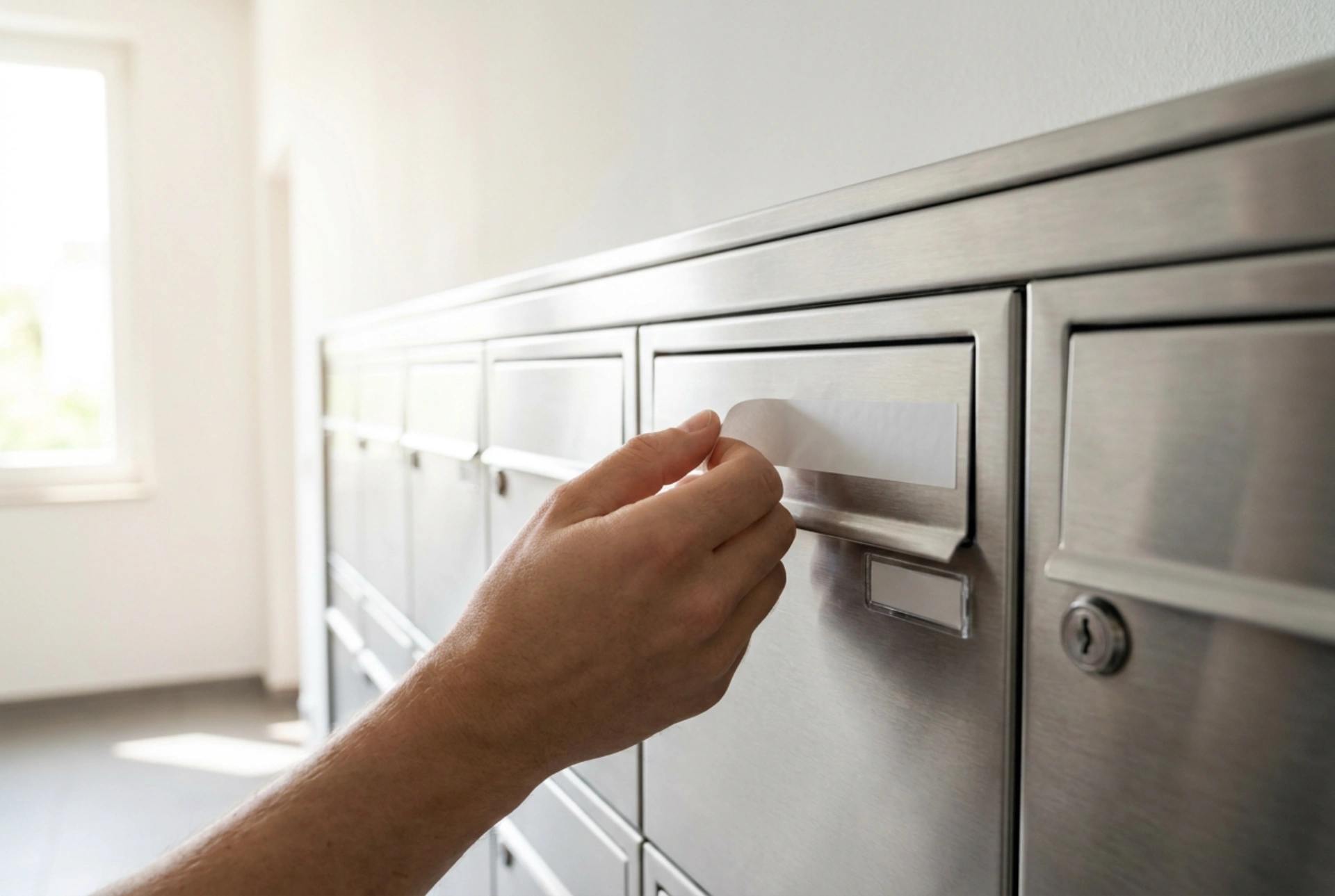
Adhesion relies on molecular contact between the adhesive and the mailbox surface. Mailbox banks, typically made of powder-coated steel, brushed aluminum, or polycarbonate, often carry microscopic layers of oil, dust, and manufacturing residues. Standard soapy water leaves a surfactant film that compromises the adhesive bond, leading to premature edge-lifting.
- Degrease the Surface: Use a 70% isopropyl alcohol solution to clean the specific area. Isopropyl alcohol dissolves non-polar compounds like skin oils and greasy residues without damaging powder coatings or plastics.
- Avoid Mineral Spirits: Do not use heavy solvents like acetone or turpentine, which can strip protective paint coatings or melt plastic components.
- Thermal Conditions: Apply labels at room temperature (ideally between 15°C and 25°C). Low temperatures increase the viscosity of pressure-sensitive adhesives, preventing them from wetting the micro-roughness of the metal surface properly.
Optimal Typography and Optical Contrast
Legibility is governed by the principles of visual contrast and size scaling. For a courier or postal worker reading labels from a distance of one to two meters, the choice of font and color scheme directly dictates processing speed and error reduction.
A high-contrast scheme—such as black text on a matte white background or white text on a dark charcoal background—provides the sharpest definition. Avoid metallic-on-metallic configurations (e.g., silver text on brushed steel), as specular reflection under overhead fluorescent lighting renders the text unreadable from certain angles. Utilize sans-serif typefaces with uniform stroke widths, which remain legible even when viewed under low light conditions.
Non-Destructive and Modular Labeling Solutions
In many multi-family residential complexes, building regulations or rental agreements prohibit permanent modifications to mailboxes. In these scenarios, non-destructive, modular labeling systems must be utilized to maintain order without damaging the underlying structure.
If the mailboxes feature built-in clear plastic windows, use high-grade cardstock (at least 160 gsm) printed with pigment-based inks, which resist UV fading far better than dye-based inks. For steel mailboxes lacking cardholder slots, flexible magnetic strips backed with vinyl lettering provide a completely removable solution. These magnets utilize a strontium ferrite matrix that adheres firmly to ferromagnetic metals without leaving any adhesive residue behind.