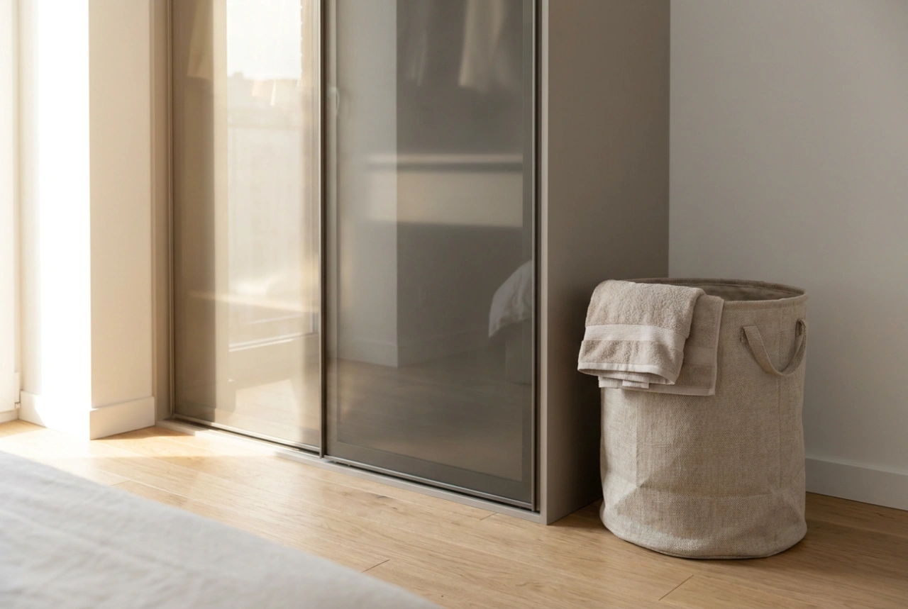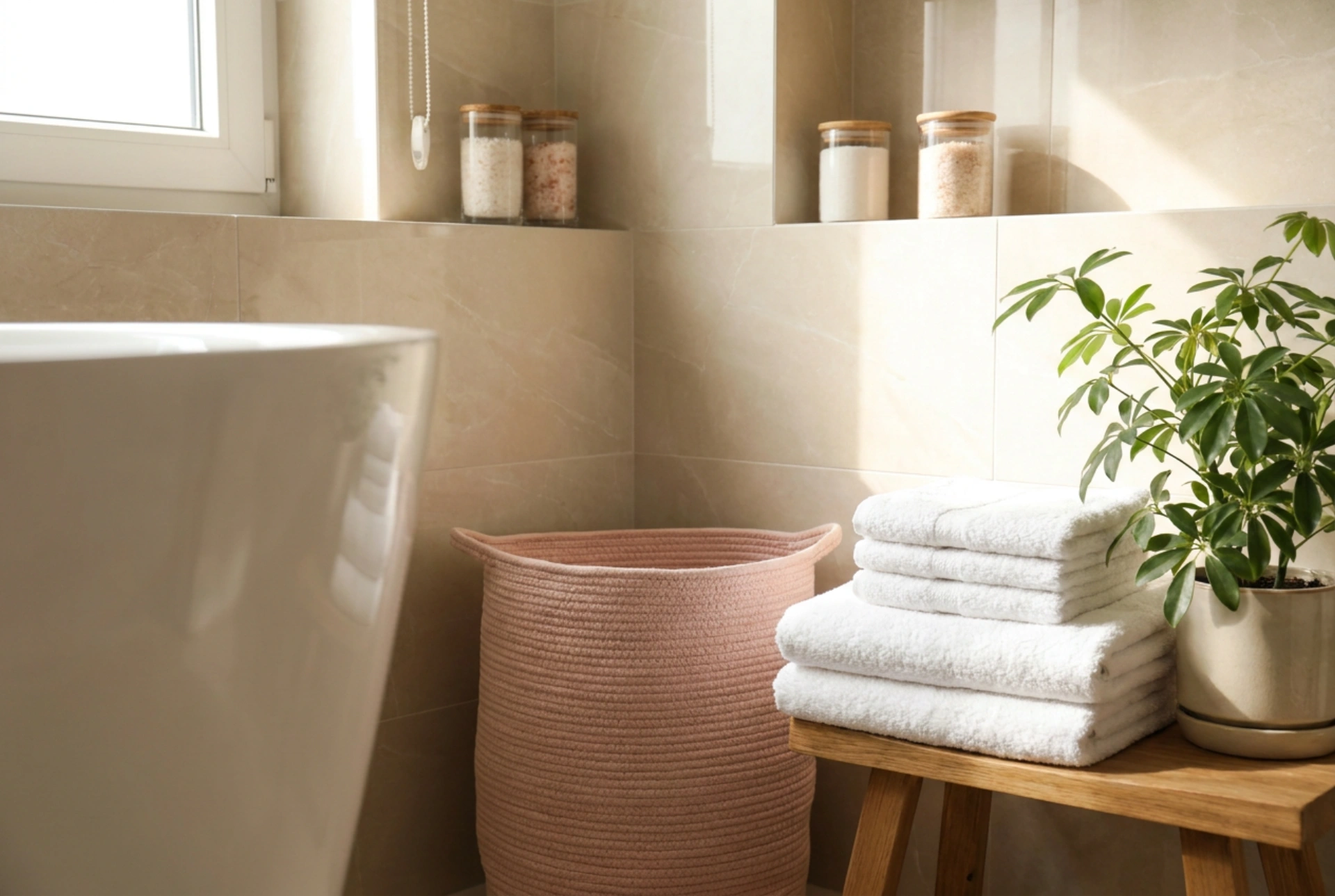


Integrating a pink laundry basket into a practical bathroom requires balancing colour psychology with functional ergonomics to ensure the space remains both highly efficient and visually cohesive.
The Science of Visual Weight and Material Selection
Pink is often perceived as a challenging accent colour in utilitarian spaces, yet its integration relies on understanding visual weight and light reflectance values (LRV). Soft pink tones possess a high LRV, meaning they reflect a significant portion of natural and artificial light, which helps to maintain an airy, open feel in typically compact bathroom layouts. To prevent the laundry basket from appearing as an isolated, discordant element, it must be matched with the correct material textures.
For modern bathrooms finished with polished ceramic tiles, marble, or engineered quartz, a matte-finished or woven pink basket creates a subtle textural contrast. Smooth, high-gloss plastics in bright pink can create harsh reflections that disrupt the soothing environment of a wet room. Opting for materials such as powder-coated metal with perforation, high-density polyethylene (HDPE) with a matte finish, or a heavy-duty canvas basket with a removable liner ensures both structural durability and sophisticated light diffusion.
Optimising Ergonomics and Airflow Pathways
The positioning of a laundry basket dictates the physical flow of the room. Placing it adjacent to wet zones—such as showers or bathtubs—is highly practical but exposes the basket to high relative humidity. This proximity demands careful consideration of ventilation physics to prevent the growth of mould and mildew on stored fabrics.
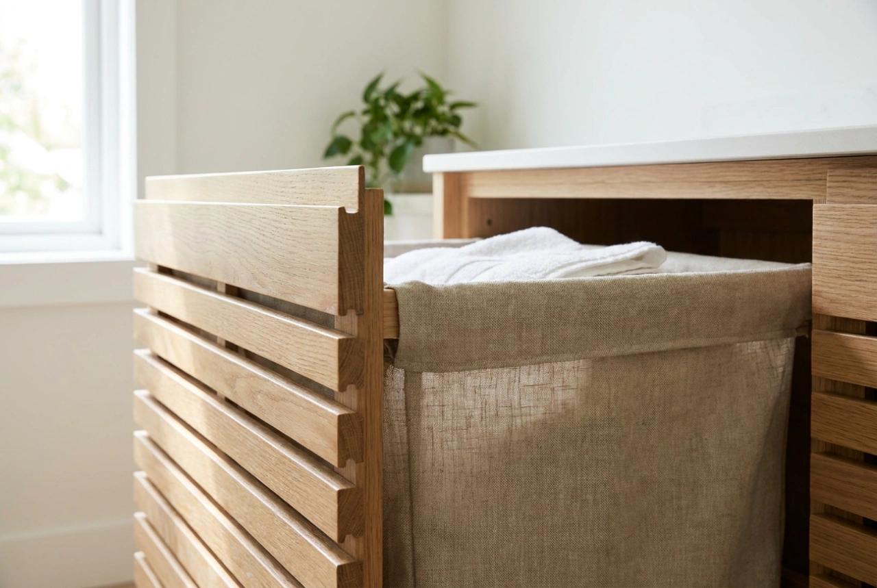
- Ventilation: Choose a basket design featuring structural perforations or an open-weave pattern to facilitate continuous air circulation. This prevents stagnant, moisture-laden air from settling within the soiled laundry.
- Proximity to the Washing Machine: If your laundry appliance is located in the bathroom, position the basket within an arm's reach (approximately 60 to 80 centimetres) to minimise unnecessary lifting and bending, thereby adhering to sound ergonomic principles.
- Clearance Zones: Ensure the basket does not obstruct the swing radius of shower doors, cabinets, or entranceways. A recessed niche or a dedicated corner on polished tiles serves as an ideal anchor spot.
Balancing the Colour Palette with Complementary Elements
To integrate a pink laundry basket seamlessly, the surrounding environment must support its presence without succumbing to visual clutter. Soft pink acts as an excellent warm counterpoint to the naturally cold surfaces of porcelain and chrome. To ground this hue, introduce complementary tones that neutralise its sweetness.
Deep slate greys, charcoal, and muted olive greens provide an excellent anchor. For instance, placing a stack of crisp, folded white towels nearby establishes a clean, clinical baseline, while a single resilient green plant, such as a Boston fern or snake plant, introduces organic textures that harmonise with the warm undertones of the pink. This creates a balanced, tripartite colour scheme of cool whites, organic greens, and warm pink accents, transforming the utility basket into a deliberate design choice.
Hygiene and Material Maintenance
Bathrooms are high-humidity zones subject to soap scum, limescale, and biological residue. Maintaining the cleanliness of your laundry basket is essential for household hygiene. Fabric liners should be removed weekly and laundered at a minimum of 60°C to eliminate dust mites and skin flora. For plastic or powder-coated metal baskets, a regular wipe-down with a diluted solution of non-ionic surfactants and warm water will dissolve surface grime without compromising the material integrity or causing colour degradation.