

Designing a photo album with dark or black pages requires a deliberate approach to visual contrast, spatial geometry, and material chemistry. Unlike traditional white pages, dark backgrounds absorb light and alter how the human eye perceives colors and borders, making precise layout planning essential.
The Science of Contrast: Why Dark Pages Demand Precision
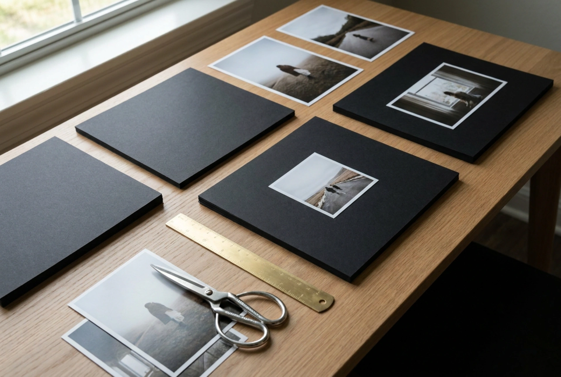
To understand why layouts must change on dark pages, one must look at the physics of light absorption. A black or dark gray paper page absorbs up to 90% of visible light, whereas white paper reflects it. This means the negative space around your photographs does not just sit in the background; it actively frames them. Photos with dark edges or low contrast can easily bleed into the page, losing their definition. To combat this, you must introduce a deliberate boundary. Leaving a white border around your prints, either during the printing process or by mounting them on thin, light-colored cardstock before placing them in the album, creates a sharp transition zone. This boundary stops the light from scattering unevenly and ensures that the eye immediately identifies the photo's edge.
Geometric Arrangements and Visual Weight
Arranging photos on dark sheets requires strict adherence to geometric alignment to avoid a chaotic appearance. Because dark pages offer a high-contrast canvas, even a minor misalignment of one or two millimeters is instantly visible. To achieve a balanced spread, follow these structural rules:
- Maintain Consistent Negative Space: Keep the distance between photos, the gutters, uniform throughout the entire album. A spacing of 10 to 15 millimeters is ideal. Using a physical spacer, such as a brass ruler or a pre-cut piece of heavy cardstock, ensures consistency.
- Establish a Dominant Anchor: Every spread should have one primary photo that is roughly 30% larger than the surrounding supporting images. Place this anchor photo on the top-left or center-right of the spread to match natural eye-tracking patterns.
- Align Along a Common Axis: Use a horizontal or vertical baseline. Aligning the top edges of a row of photos, or their vertical centers, creates an invisible line of symmetry that stabilizes the high-contrast environment.
The Material Science of Adhesives on Dark Paper
The choice of adhesive is critical when working with dark album pages, both for structural longevity and visual neatness. Dark paper fibers are highly sensitive to moisture and light-refraction changes. Standard liquid glues contain high water content, which penetrates the paper fibers, causing them to swell and warp. This warping becomes highly visible as shadows under light. To prevent deformation, use dry adhesive methods:
- Acid-Free Double-Sided Tape: Acrylic-based, pressure-sensitive adhesive tapes provide a permanent bond without introducing moisture. Apply the tape close to the edges of the photo to prevent curling.
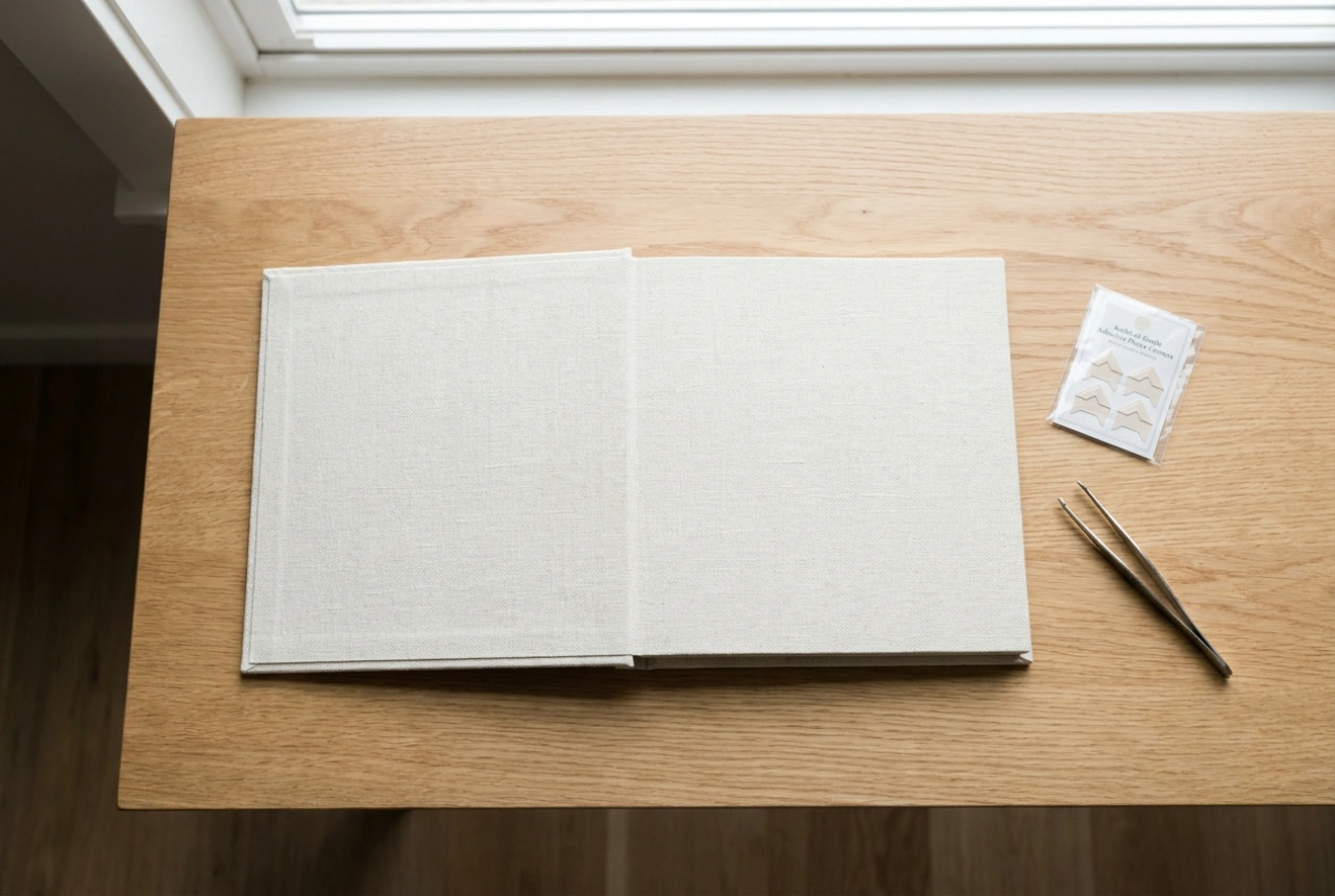
- Mounting Squares or Photo Corners: If you wish to preserve the integrity of the print, physical photo corners are ideal. Clear polypropylene corners disappear on dark pages, while black paper corners offer a subtle, integrated look.
- Archival Compatibility: Ensure all adhesives are acid-free and lignin-free. Over time, acidic adhesives react with the lignin in wood-pulp papers, causing yellowing and chemical degradation of both the print and the dark album page.
Balancing Color Temperatures and Print Finishes
The chemical composition of your prints interacts directly with the dark background. Matte and luster prints perform exceptionally well on dark pages because they scatter light diffusely, reducing glare. High-gloss prints, conversely, create harsh reflections that clash with the light-absorbing qualities of dark paper. When selecting photos, consider their color temperature. Warm, high-saturation images featuring golds, oranges, and deep reds pop dramatically against black backdrops due to complementary contrast. Cool-toned or low-saturation images can appear washed out unless they are framed with a light border to separate their cool tones from the deep, absorbing tones of the page.
Step-by-Step Layout Execution Checklist
Before applying any adhesive, execute this structural workflow to guarantee a perfect finish:
- Dry Fit: Lay out all photos on the spread without adhesive to check the visual balance and spacing.
- Measure and Mark: Use a soft graphite pencil to lightly mark the corners of the photos. Do not press hard, as scoring dark paper creates permanent white indentations in the fibers.
- Apply Pressure: Once the photos are positioned with dry adhesive, press firmly from the center outward using a clean, soft cloth to activate the pressure-sensitive bond without transferring finger oils.