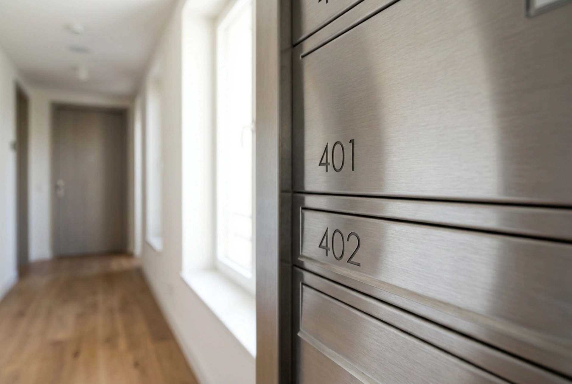


Clear labelling on residential mailboxes is the primary factor preventing misdelivered or returned mail. Achieving long-lasting legibility and durability requires understanding the physics of visual contrast, typographical hierarchy, and the chemistry of adhesive bonding on metallic or polymeric surfaces.
Optimising Visual Ergonomics and Contrast
Postal carriers spend only a fraction of a second scanning each mailbox label. To facilitate rapid cognitive processing, labels must employ high-contrast typography. From a physiological standpoint, the human eye detects shapes and boundaries through luminance contrast rather than color differences alone. Black text on a matte white or brushed silver background provides the highest luminance contrast ratio, minimising errors under low-light conditions common in residential hallways.
Font selection is equally critical. Sans-serif typefaces with uniform stroke widths are processed faster by the brain than serif fonts, which can blur when viewed from an angle or in dim lighting. Letter height should be scaled to the reading distance; a minimum character height of 10 millimetres is recommended for standard corridor distances. Avoid all-caps formatting for long names, as lowercase letters create a distinct word shape that the brain recognises instantly, whereas strings of capital letters force the reader to decode each character individually.
The Chemistry of Adhesion on Metallic Surfaces
Most residential mailboxes are manufactured from brushed stainless steel, anodised aluminium, or powder-coated steel. Applying a label that will not peel, curl, or degrade over time requires matching the adhesive to the substrate's surface energy. Metals have high surface energy, which generally allows adhesives to wet out or spread evenly, creating a strong molecular bond. However, surface contaminants like dust, finger oils, and manufacturing residues act as a barrier, preventing intimate contact between the adhesive and the metal.
To ensure a permanent bond, follow this precise preparation protocol:
- Clean the surface thoroughly using a 70% isopropyl alcohol solution. Avoid glass cleaners or soapy water, as they often leave behind a microscopic surfactant residue that interferes with adhesive wet-out.
- Allow the solvent to evaporate completely, leaving a clean, dry, high-energy surface.
- Apply the label starting from one edge, using a firm rubbing motion with a plastic squeegee or the edge of a plastic card to expel air pockets. This mechanical pressure activates pressure-sensitive acrylic adhesives, forcing them into the microscopic valleys of the metal surface.
Selecting Materials for Environmental Resilience
The choice of label material determines its resistance to environmental degradation. Standard paper labels with water-based adhesives are highly susceptible to humidity, leading to fibre swelling, ink bleeding, and adhesive failure. For indoor corridors, polyester or polypropylene synthetic labels are superior. These polymers do not absorb moisture and possess high tensile strength, preventing tearing during cleaning cycles.
For outdoor mailboxes, the primary threat is photodegradation caused by ultraviolet (UV) radiation. UV light breaks down the polymer chains in both the label material and the ink, causing yellowing, brittleness, and fading. To counteract this, use thermal transfer printing with resin-based ribbons rather than standard dye-based inkjet printing. Resin thermal transfer physically fuses a durable polymer pigment onto the label face, offering exceptional resistance to UV exposure, rain, and temperature fluctuations ranging from sub-zero winter conditions to intense summer heat.
Information Hierarchy and Standardisation
An unstructured mailbox label causes cognitive friction and increases delivery errors. Establish a consistent layout across all mailboxes in the building. The primary identifier, usually the apartment or flat number, should be positioned prominently, ideally on the left or top-left of the label, as Western reading patterns scan from left to right. The font size of the room number should be at least 50% larger than the names of the occupants.
Occupant names should follow a standardised format, such as Surname, First Initial. This minimises clutter on the limited surface area of the mailbox. Using a modular labelling system, where numbers are permanent plates and names are held in clear, UV-stabilised polycarbonate slip-in sleeves, allows for easy updates when residents change without damaging the underlying mailbox finish.