

Gold wall clocks can easily dominate a space, shifting the aesthetic from refined to gaudy if the surrounding materials and light interactions are not carefully managed. Achieving a sophisticated balance relies on understanding light reflection, color theory, and spatial proportions within the room.
Specular vs. Diffuse Reflection: Choosing the Right Metallic Finish
The visual impact of a gold clock depends heavily on its surface texture, which dictates how it reflects light. Highly polished gold surfaces produce specular reflection, where light rays bounce off at a uniform angle, creating intense, focused highlights. This finish can easily feel overwhelming and visually loud, especially under direct sunlight or harsh overhead lighting. In contrast, brushed or matte gold finishes feature microscopic surface irregularities that scatter light in multiple directions. This diffuse reflection softens the metallic sheen, yielding a warm, subtle glow that integrates naturally into living spaces.
When selecting a placement, consider the room’s primary light sources. If the wall receives direct, unfiltered sunlight, a polished finish will produce distracting glares. In these zones, a brushed, satin, or antique gold finish maintains its character without blinding the viewer. Save polished finishes for darker, indirect lighting conditions where the surface can catch and amplify faint ambient light to create a gentle focal point.
The Science of Color Contrast: Selecting the Backing Surface
A gold clock does not exist in isolation; its visual weight is defined by the wall behind it. Gold possesses warm, yellow-orange undertones. To prevent the clock from looking cheap or lost, the wall color must provide a balanced contrast in both hue and value.
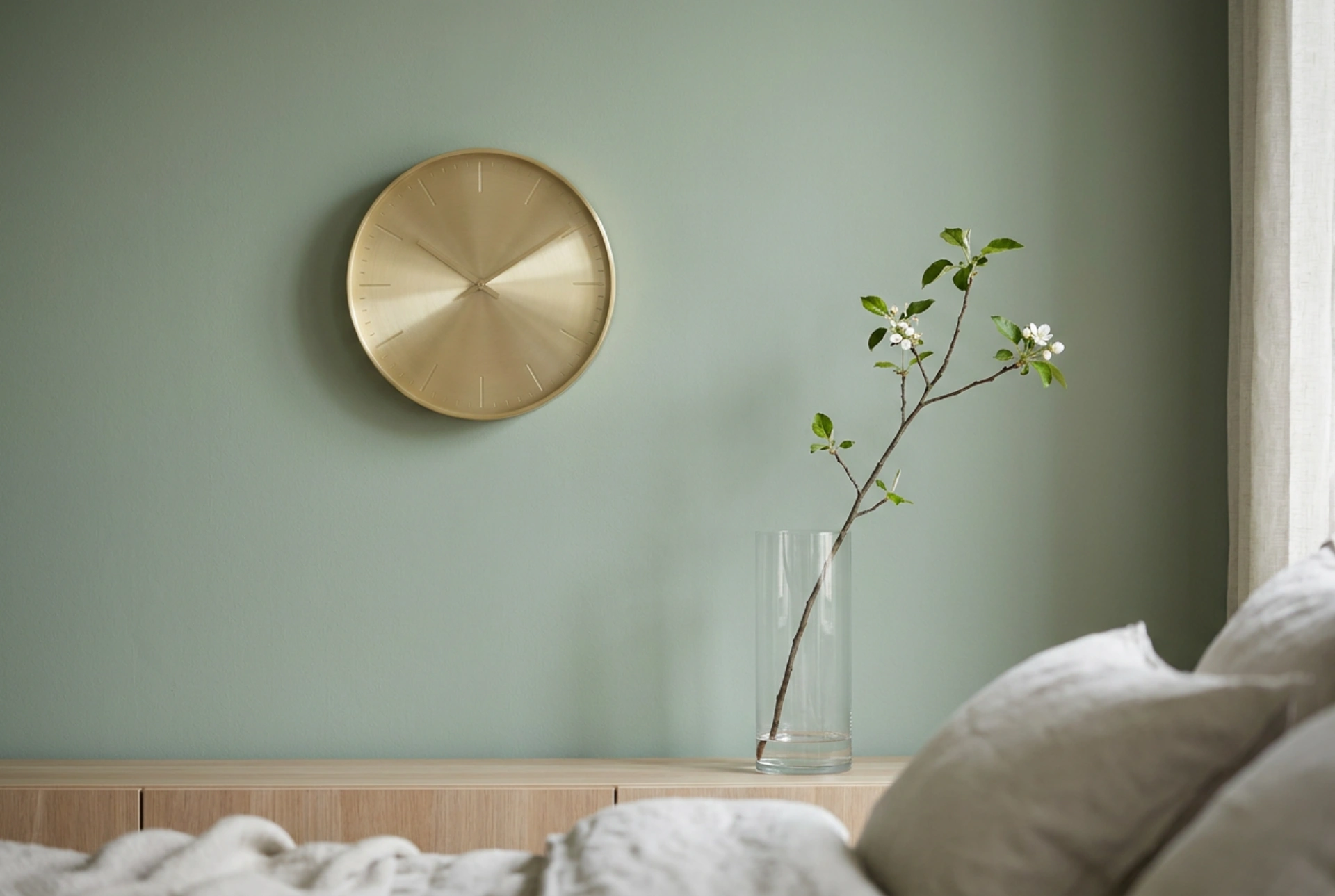
- Muted Cool Tones: Earthy green tones (like sage or olive), slate gray, and dusty blue are highly effective. Because green and blue sit opposite to yellow-reds on the color wheel, they create a natural complementary contrast that makes the gold pop without feeling aggressive.
- Deep Matte Shades: Dark charcoal, navy, or forest green absorb a high percentage of ambient light. This low reflectance allows the warmer, reflective gold clock to stand out with clean, sophisticated clarity.
- Avoid Warm Overlap: Mounting a gold clock on a warm yellow, beige, or high-gloss white wall reduces contrast, making the metal look muddy or unnecessarily stark. A matte finish on the wall is crucial, as it prevents competing reflections and anchors the clock as a distinct graphic element.
Spatial Dynamics and the Rule of Negative Space
A common mistake is squeezing a metallic clock into a tight space between shelves or hanging it too close to other decorative elements. Because gold has high visual weight, it requires a buffer zone of negative space to breathe. This negative space acts as a visual buffer, preventing the eye from feeling overwhelmed by too many competing stimuli.
Ideally, maintain an empty boundary around the clock that is at least 1.5 times the diameter of the clock itself. For installation height, position the center of the clock at standard eye level—approximately 145 to 150 centimeters from the floor. If positioning it above furniture, such as a sideboard, ensure the clock sits roughly 20 to 30 centimeters above the furniture's top surface. This creates a cohesive grouping rather than leaving the clock floating aimlessly on the wall.
Counterbalancing Metal with Organic Textures
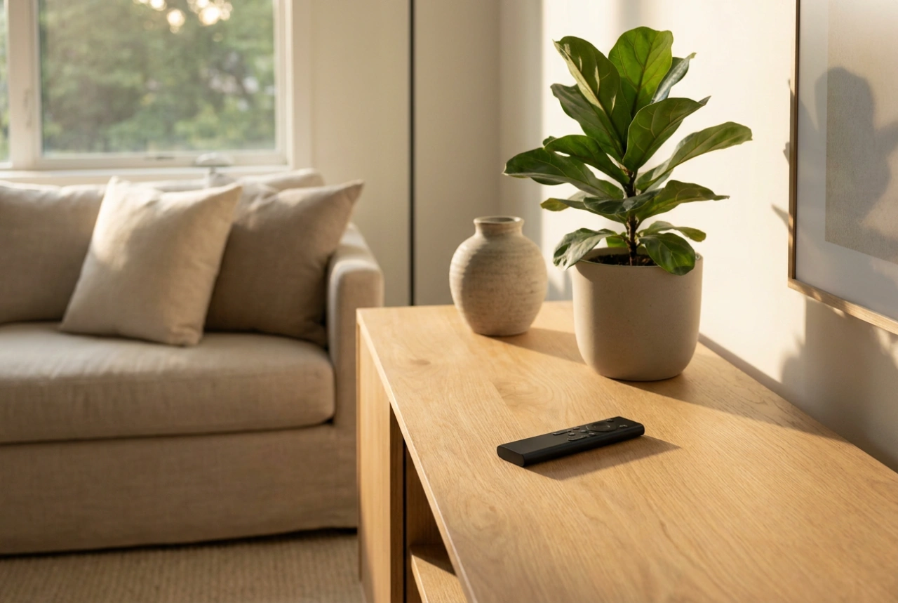
To soften the inherent coldness and rigidity of metal, introduce organic, non-reflective materials nearby. Wood, glass, clay, and natural fibers act as visual counterweights to the gold's metallic properties.
A simple arrangement, such as a slender dried branch in a clear glass vase positioned slightly off-center below or beside the clock, introduces organic asymmetry. The natural lines of the branch break up the perfect geometry of the clock, while the glass vase allows light to pass through, keeping the overall composition light and airy. Combining the clock with matte ceramic vessels or raw wood elements grounds the metallic piece, creating a balanced, lived-in aesthetic rather than a sterile showroom feel.