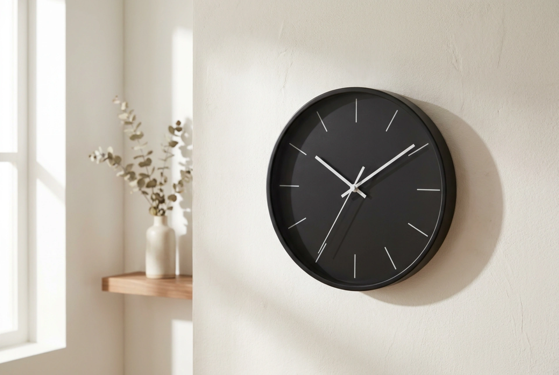


Integrating a large black wall clock requires a precise understanding of visual weight and contrast to prevent it from overpowering a room. By applying principles of color theory, geometry, and lighting physics, you can transform a heavy black timepiece into a perfectly balanced design anchor.
The Physics of Visual Weight and Contrast
Black objects possess the highest visual weight in interior design because they absorb almost all visible light. When you place a large black wall clock on a light-colored or textured wall, it creates an intense high-contrast focal point that immediately draws the eye. To balance this stark contrast, you must introduce elements that offset the "gravitational pull" of the black circle.
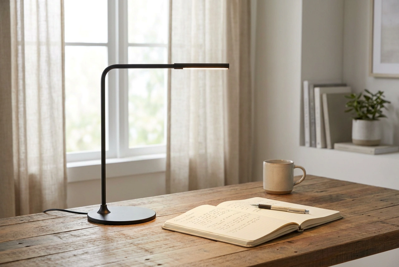
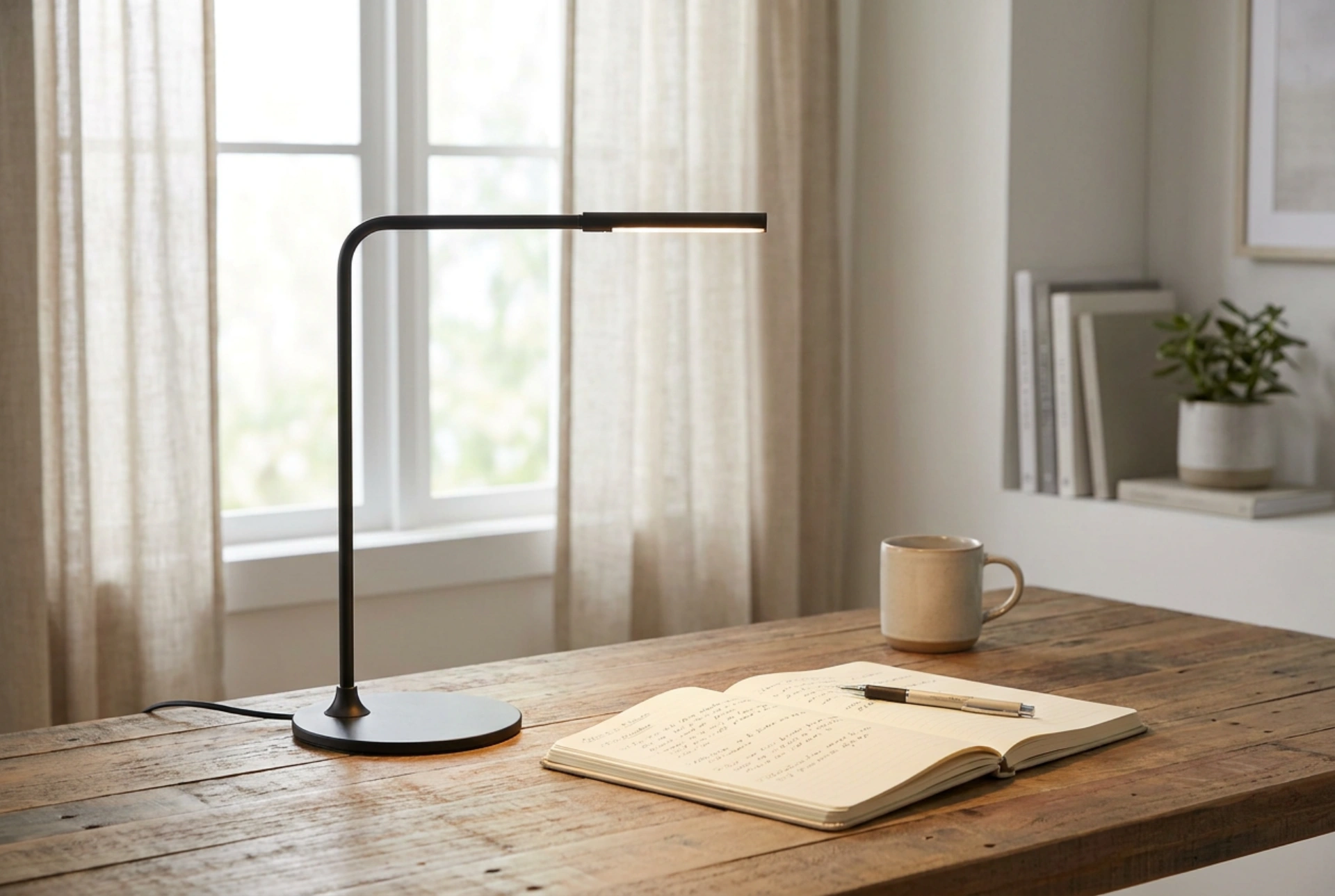
Instead of leaving the clock as an isolated dark mass, distribute secondary black accents throughout the room. This technique, known as visual anchoring, utilizes small black elements—such as a slim lamp base, metal picture frames, or furniture legs—to create a cohesive visual path. This prevents the clock from appearing like a black hole on the wall, dispersing its visual weight across the entire space and establishing a sense of rhythm.
Proportion, Scale, and the Rule of Thirds
The positioning of a large clock must respect the proportions of the wall and the surrounding furniture. A common mistake is hanging the clock too high or centering it on an empty wall without any structural relationship to the furniture below. For optimal balance, apply the rule of thirds and consider the vertical alignment of your room.
- The Anchor Relationship: If placing the clock above a sideboard or console table, the diameter of the clock should ideally be between 50% and 60% of the total width of the furniture below. This ratio creates a stable, visually pleasing pyramidal composition.
- Mounting Height: The center of the clock should rest at eye level, which is approximately 145 to 150 centimeters from the floor. If placed above furniture, allow a clearance of 15 to 25 centimeters between the bottom of the clock and the top of the furniture piece to give the object room to breathe.
- Negative Space: Ensure there is ample negative space around the clock. The surrounding wall area should be at least twice the diameter of the clock itself to prevent a cramped, cluttered appearance that disrupts the room's energy.
Balancing Textures and Surface Finishes
The material finish of both the clock and the wall plays a critical role in how the object is perceived by the eye. A matte black clock absorbs light completely and feels heavier, whereas a glossy or metallic black finish reflects light, softening its visual impact. To balance a matte finish, pair it with textured wall surfaces such as raw plaster, linen-textured wallpaper, or exposed brick.
The micro-shadows created by a textured plaster wall diffuse the harsh boundary between the black clock and the light wall. This softens the transitions and makes the clock feel integrated into the structure of the room rather than merely stuck onto it. If the clock features metallic accents, such as brass or copper hands, echo these metallic tones in nearby hardware or light fixtures to create a subtle, harmonious dialogue of materials.
Managing Light and Reflections
How light hits the clock determines its daily visual impact. Natural morning light hitting a clock at an angle creates soft shadows that emphasize its three-dimensional form and texture. However, direct, harsh artificial lighting can create glare on glass-fronted clocks, rendering them unreadable and visually disruptive.
For optimal results, position the clock perpendicular to primary light sources, such as windows. If using artificial spotlights, use diffused, warm LED bulbs (2700K to 3000K) to soften the black silhouette. Avoid placing a powerful light source directly opposite a glass-faced clock; instead, opt for ambient uplighting or wall sconces that cast a soft glow around the perimeter of the timepiece, accentuating its shape without causing glare.