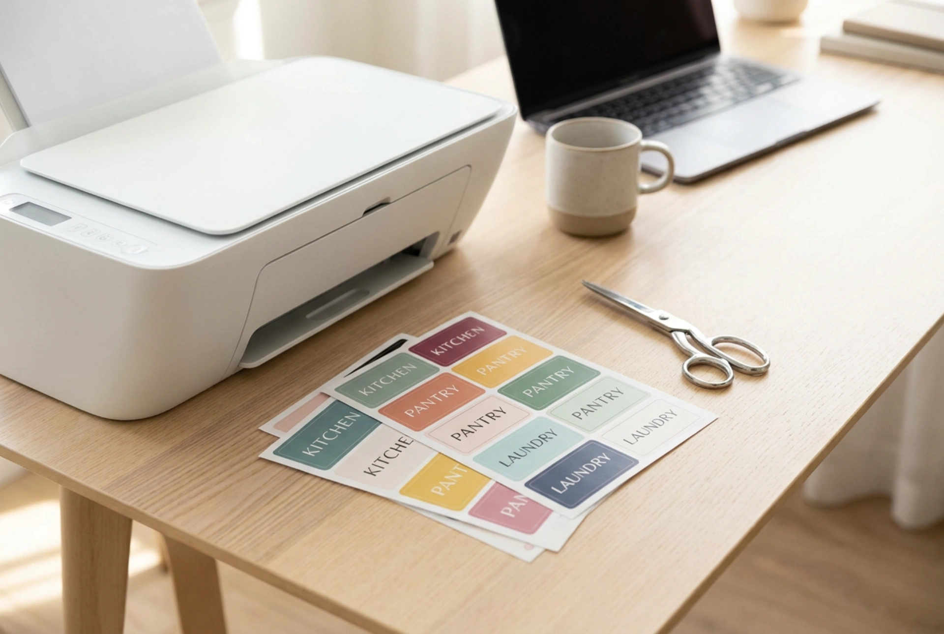


Achieving sharp, professional-grade borders on home-printed labels requires more than just a high-quality printer; it demands an understanding of digital image resolution, ink chemistry, and paper absorption. By managing these technical variables, you can eliminate bleed and blur to produce crisp, vibrant labels for organizing your home or workshop.
The Physics of Image Resolution: Vector vs. Raster
The primary cause of fuzzy edges on printed labels is pixelation, which occurs when a low-resolution digital file is scaled up. Images are generally created in one of two formats: raster or vector. Raster images (such as JPEGs or PNGs) are composed of a fixed grid of pixels. When these images are enlarged, the printer attempts to fill the gaps by interpolating pixels, which creates a soft, blurry transition instead of a sharp line.
To avoid this, always design text and geometric shapes using vector graphics, which rely on mathematical formulas rather than pixels to define lines and curves. Vector files can be scaled infinitely without any loss of quality. If you must use raster formats, ensure the file is set to a minimum resolution of 300 DPI (dots per inch) at the exact physical dimensions of the final printed label. This density ensures that the printer has enough raw data to output distinct, micro-fine boundaries.
Color Space Conversion: RGB to CMYK
Computers display colors using the RGB (Red, Green, Blue) spectrum, which is an additive light model. Printers, however, use the CMYK (Cyan, Magenta, Yellow, Key/Black) subtractive color model, where physical inks absorb specific wavelengths of light. When a printer driver automatically converts an RGB file to CMYK, it often misinterprets highly saturated neon tones, translating them into overlapping layers of primary inks that blur the edges of fine text.
To prevent this color shift and muddying of boundaries, set your design software's color space to CMYK before you begin drafting. This allows you to see how the physical inks will interact on the page. For sharp black text, avoid using "rich black" (a mix of all four inks), which requires the printer to lay down multiple wet layers that can bleed. Instead, configure text to use 100% "Key" black ink, which prints from a single nozzle array to maintain absolute sharpness.
Paper Chemistry and Inkjet Absorption
The surface of your label paper plays a critical role in edge definition. Standard copy paper has highly porous, untreated cellulose fibers that draw in liquid ink through capillary action, causing the ink to spread horizontally. This phenomenon, known as dot gain, is the leading cause of blurry, bleeding boundaries on adhesive sheets.
For crisp results, select matte or glossy adhesive paper specifically engineered for your printer type (inkjet or laser). Inkjet-compatible label papers are treated with a microscopic, porous receiving layer—often made of silica or clay—that instantly absorbs the liquid solvent of the ink while locking the color pigments on the surface. Laser label sheets, on the other hand, are designed to withstand the high heat of a fuser unit without melting the adhesive, allowing the dry plastic toner particles to bond precisely to the surface fibers.
Printer Calibration and Driver Optimization
Even a perfect digital file will print poorly if the printer's mechanical components are misaligned. Over time, the microscopic nozzles of an inkjet print head can shift out of alignment, causing ink droplets to land slightly offset from one another. Run a print head alignment cycle through your printer's utility software to ensure that the physical cyan, magenta, yellow, and black print heads are synchronized to the fraction of a millimeter.
Furthermore, never use the "Standard" or "Draft" print settings for detailed labels. Select the "High Quality" or "Photo" setting, which slows down the print head carriage speed and allows the ink to dry slightly between passes. Ensure you select the correct media type in the printer dialog (e.g., "Premium Matte" or "Photo Paper Glossy"). This adjustment tells the printer's microprocessors to regulate the exact volume of ink deposited, preventing over-saturation and subsequent bleeding.
Quick Checklist for Perfect Label Prints
- Design in vector format or use a minimum of 300 DPI for raster files.
- Convert the workspace to CMYK color mode before designing.
- Use 100% black (K) for fine text, rather than composite black.
- Select specialized inkjet or laser adhesive paper with a micro-porous coating.
- Run a print head alignment cycle to eliminate mechanical ghosting.
- Set the print driver to high quality and match the media type to your paper.